Belong Youth Conference: Non-profit Brand Identity
Client: Belong Youth Conference (local nonprofit) * Role: Brand Designer (solo) * Deliverables: Logo, color system, typography, full brand guidelines
The Brief: Belong Youth Conference came to me without a cohesive visual identity. They had a lot of their brand is in one software, but not on one page. I was given access to their software, and gathered everything together. I made a few extra graphics and logos that they loved. That way when they need to use their brand identity, it's in one place that scale across everything from printed flyers to a full year of social content.
My Role: I was given access to their software, and gathered everything together. I made a few extra graphics and logos that they loved. That way when they need to use their brand identity, it's in one place that can scale across everything from printed flyers to a full year of social content, and a complete brand guidelines document the client (and any future collaborators) can use to keep materials consistent.
Process:
1. Discovery -- Used the software they use where all their brand identity is kept in different locations.
2. Concepting -- Developed 4 extra logos to add, as well as some extra graphics that they can use.
3. Refinement -- Narrowed to one direction, then with feedback from the president expanded on their ideas and made sure all current use of the brand is correct.
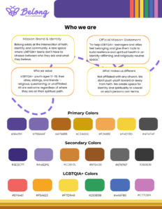
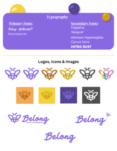
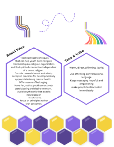
4. Systemization -- Built the full identity: primary/secondary logo lockups, color palette, typography pairing, and usage rules.
5. Delivery -- Packaged everything into a brand guidelines document for long-term consistency.
Outcome: Belong now has a complete, professional brand system ready to carry them through their 2026 programming, including the upcoming full year of social media templates currently in production. The client was excited enough about the result to bring me on for additional motion graphics and video work.
Testimonial: "Rebecca created a brand guide for Belong Youth Conference. She was creative and comprehensive and we look forward to working with her more in the future." - Austin Peterson, Belong President
Tools: Adobe Illustrator, Adobe InDesign, Adobe Photoshop
Hocus Pocus Inspired Projection Show
Client: Type: Speculative product, sold to residential customers * Role: Concept, Animation, Sound Design, Sales (solo) * Result: 4 units sold
The Brief: With Hocus Pocus 2 releasing in fall 2022, I saw an opportunity: a lot of people love that movie, Halloween projection shows were growing in popularity, and nobody local was offering a themed show built around it. Rather than wait for a client to ask, I built it myself as a product I could sell directly to homeowners.
My Role: I came up with the projection all on my own: concept, animation, sound design, sync, and finding buyers. There was no client brief; the creative decisions were entirely mine.
Process:
1. Market awareness -- Recognized the Hocus Pocus 2 release as a timely hook for Halloween buyers already looking for something beyond generic store-bought projection loops.
2. Concept & animation -- Designed and animated a full themed show in After Effects, built around the Hocus Pocus visual world.
3. Sound design -- Edited and synced audio to match the animation beat-for-beat.
4. Sales -- Marketed and sold the finished show directly to residential customers.
Outcome: Sold to 4 residential homeowners. This was a fully self-initiated, self-funded project that went from idea to paying customers. Demonstrating not just production ability but the judgment to spot a market opportunity and execute on it independently.
Tools: Adobe After Effects, Envato Elements
doTERRA Summer Party: Harry Potter 3-Wall Projection Show
Client: doTERRA (corporate, employee event) * Role: Projection Designer & Technical Mapper (solo) * Year: 2024 * Deliverables: Synced multi-surface projection show
The Brief: doTERRA hired me to design a Harry Potter-themed projection show for their employee summer party, with a technical twist: the show needed to run across three separate walls and read as a single seamless scene rather than three disconnected projections.
My Role: I handled the full project independently: concept, animation, and the technical mapping required to align visuals precisely across three physical surfaces so the illusion held together for guests.
Process:
1. Site & surface assessment -- Measured and mapped the three walls to plan how the scene would wrap and align across them.
2. Concept & animation -- Designed Harry Potter-themed visuals and motion sequences in After Effects, built for a non-flat, multi-surface canvas.
3. Technical calibration -- Mapped and calibrated the projection live on-site, adjusting placement and warp until all three surfaces read as one continuous image.
4. Live event run -- Delivered the show for doTERRA's employee summer party.
Outcome: Delivered a technically complex, multi-surface projection show for a recognizable corporate client at a live employee event, demonstrating on-site technical problem-solving beyond standard single-wall projection work.
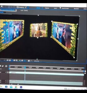
Documentation Note: Full event footage wasn't archived from this project. Portfolio piece includes a behind-the-scenes photo of the live mapping process (taken while calibrating the 3-wall layout on laptop) and one short, lower-quality clip.
Tools: Adobe After Effects, 3 Projectors